
|

|
|
|
产品故事 |
INTRODUCTION |
|
|
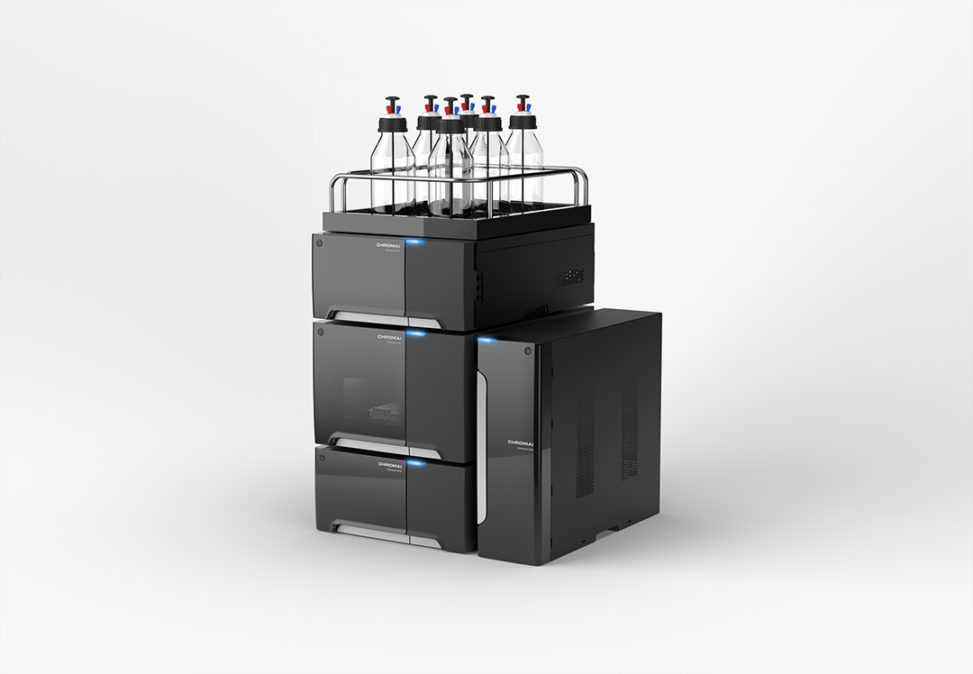
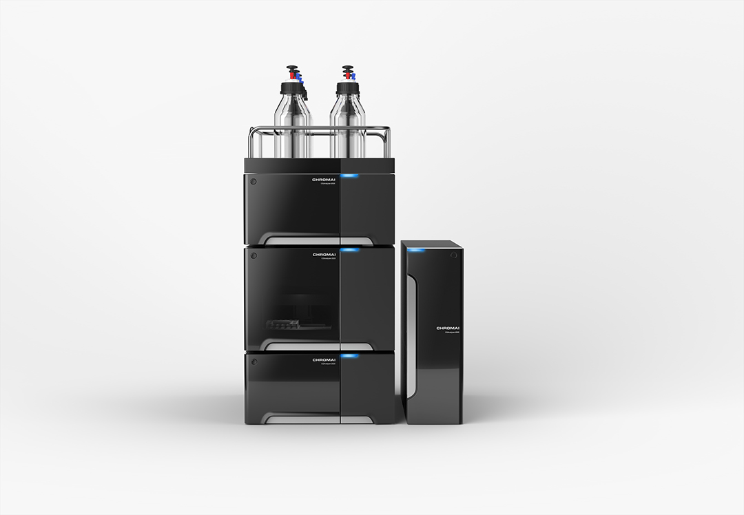
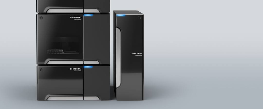
• 本款产品为客户自主研发的第一款产品,客户希望通过本次项目,树立新的品牌和产品形象。因此,分析市场产品趋势,帮助客户打造全新ICON,是本次项目的重点。 • 由于液相色谱仪功能和使用环境的限制,产品更新迭代速度较慢,世面上通用的还是几年前、甚至十几年前上市的产品,这些产品固然有很强的专业感,但也缺乏新意。这也导致了几年部分小品牌的产品,在定位上过于陈旧和保守。 • 但通过调研分析,我们发现国际上的大品牌,已然将产品线进行了大跨步的更新,大胆的 在专业、简洁的前提下,融入了消费品的设计元素,富有前瞻性的未来感和科技感。而强烈的ICON,也再次强调品牌定位,产品和品牌相辅相成。 • 设计师大胆的使用黑色作为主体色,视觉上形成了强烈的冲击力;左侧舱门采用黑色半透明材质,内部亮灯时,可以清楚观察到产品运行状况;右侧舱门采用黑色哑光材质,与左侧舱门相同颜色、不同质感,提升精致度和品质感;开门按键采用按压弹开的形式,操作方便;按键上方翘起的曲面,与银色按键相搭配,形成了产品的视觉中心,便于识别和记忆,也为后续产品的系列化设计,提供了明确的ICON。 |
• This is the first independently developed product for our customer, who hopes to establish a new brand and product image with it. Therefore, the focus of the project is to analyze market trends and help the customer with a brand-new ICON. • Due to the limitations of function and the environment of use, liquid chromatograph updating and iterating speed is slow. Most of the devices in use are those made years or even a dozen years ago. These devices, of course, have a strong sense of professionalism, but also lack innovation. This has also led to the status quo of brands less famous and the positionings old and conservative. • However, through investigation and analysis, we found that the big brands in the world---full of forward-looking sense of future and technology---have already greatly updated their product lines with newer and bolder absorbance of consumption designing elements under the premise of being professional and concise. An eye-catching icon will emphasize the positioning of the product and supplement the brand with the product. • Our designers boldly use black as the main color to form a strong visual impact. The left hatch is made of black translucent material, which can give a clear view of the running status when lights inside are on, while the right hatch is made of black matt material, the same color as the left one but with different texture, improving the delicacy and sense of quality of the product; the hatch opening button adopts the form of clicking, convenient for operation. The curved and up-warped surface above matches with the silver button, forming a visual center, which, easy to be recognized and remembered, provides a definite ICON for the successive products. |
|
|
服务内容 设计研究 造型设计 平面设计 |
SERVISE Style Design , Rearch Design , Graphic Design |