
|

|
|
|
产品故事 |
INTRODUCTION |
|
|
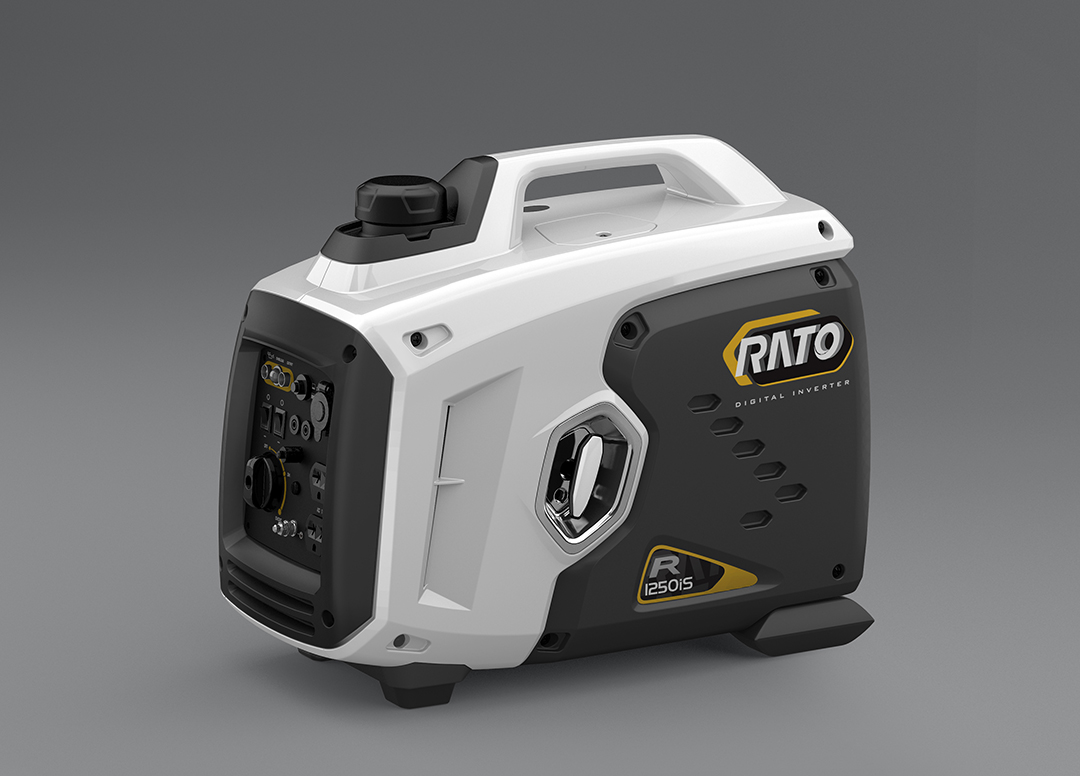
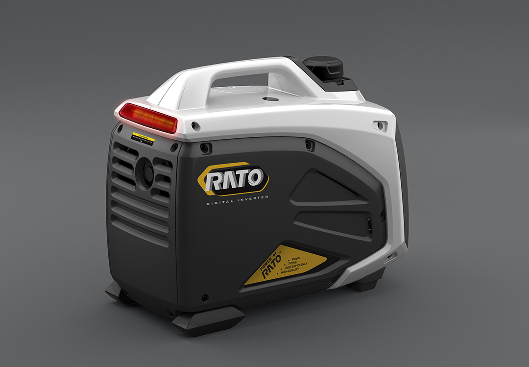
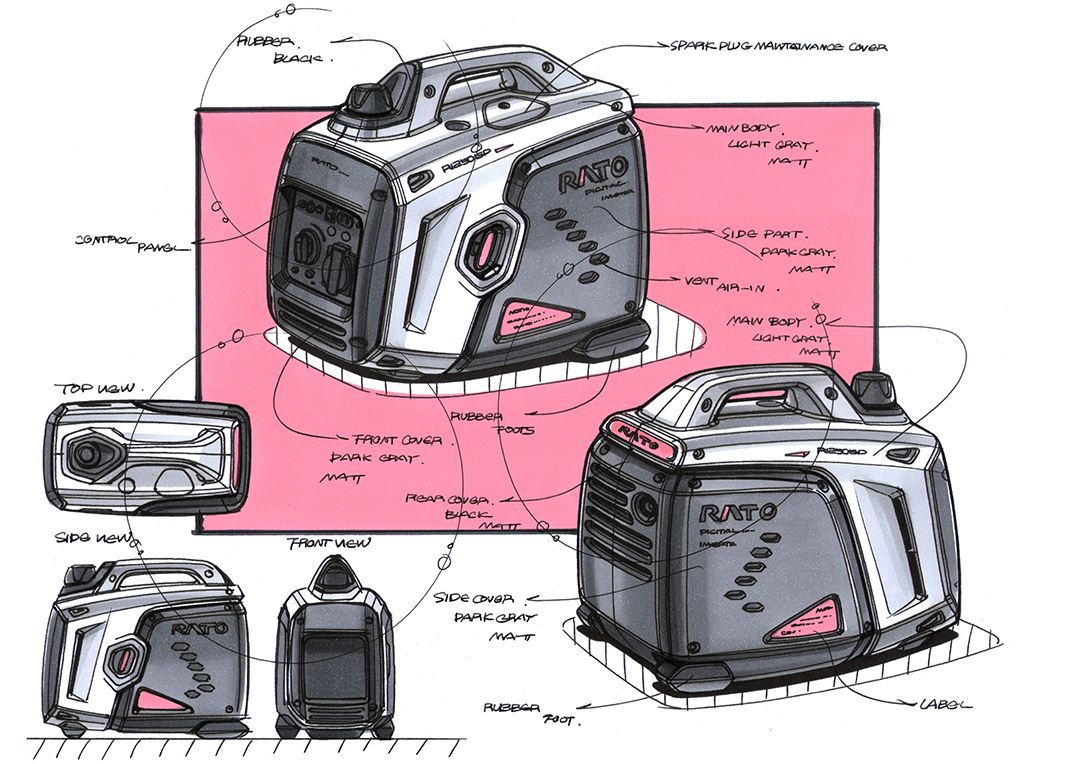
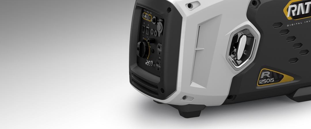
• 相比于大瓦数的发电机,1KW发电机体型小、便于携带,更多用于个人或家庭娱乐使用,因此,产品不能只局限于体现专业、性能的固有印象,而应定位于轻便、科技、潮流感,倾向于年轻化、消费化的设计趋势。 • 设计师大胆变更了分件形式,利用斜线,将产品从侧面一分为二,形成了强烈的视觉ICON,极具辨识度。多边形的切割形态,犹如未来宇宙战士的铠甲,强劲有力,富有先锋科技感。启动拉手、进风孔等也采用了不同的多边形元素,形体多变又和谐统一,丰富了视觉层次,细节更值得玩味。 • 侧面采用白色和深灰两种颜色对比,加强了视觉冲击力;细节处的多边形彩色贴纸,使产品更灵动、有活力。背面的亚克力指示灯,不仅可以使用户及时了解产品的使用状态,更是视觉上的又一个亮点,增添科技和趣味感。 |
• Compared with the large wattage generator, 1kW
generator is small, easy to carry, and more suitable for personal or family
entertainment. Therefore, the product should not be limited to reflect the
inherent impression of professional and performance, but should be positioned
in the sense of handiness, science and technology, fashion, and tend to the
design trend of youth and consumption. • The designer boldly changed the split form, using diagonal lines to split the product from the side into two, forming a strong visual icon, which is highly recognizable. The cutting shape of polygon is just like the armor of the future cosmic warrior. It is powerful and full of pioneering sense of science and technology. The starting handle and air inlet hole also adopt different polygon elements. The shape is changeable and harmonious, which enriches the visual level, and the details are worth pondering. • The side adopts white and dark gray color contrast to enhance the visual impact; the polygonal color stickers at the details make the product more flexible and energetic. The acrylic indicator on the back not only enables users to know the working status of the product in time, but also is another visual highlight, adding a sense of technology and interest. |
|
|
服务内容 设计研究 造型设计 平面设计 |
SERVISE Style Design , Rearch Design , Graphic Design |