 |
 |
 |
|
产品故事 |
INTRODUCTION |
|
|
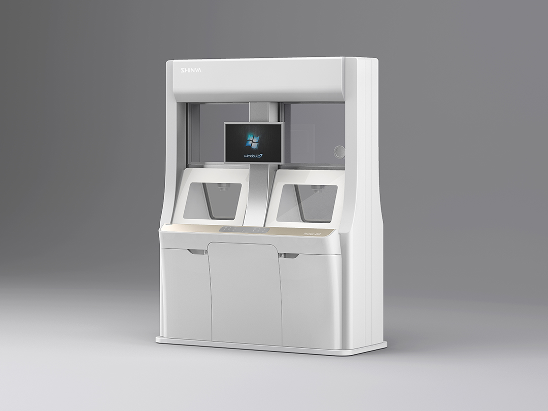
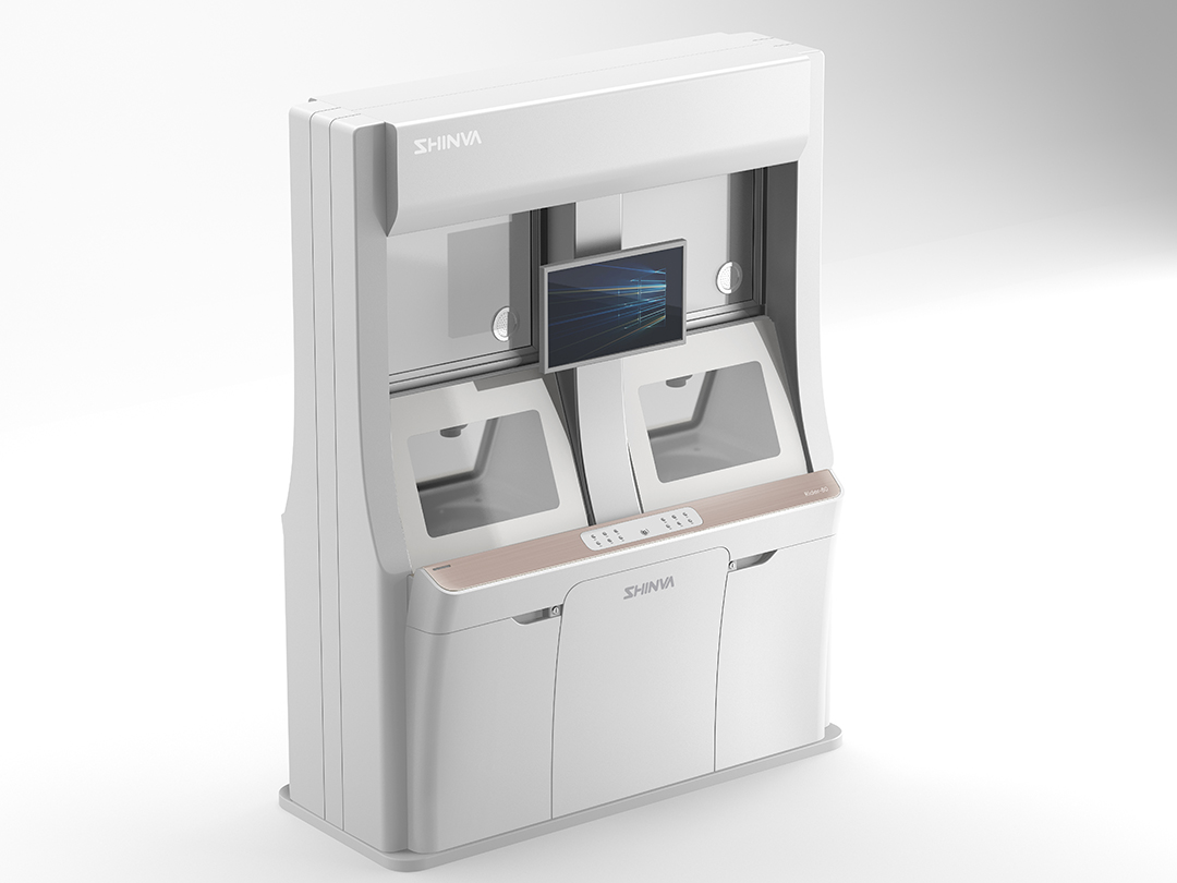
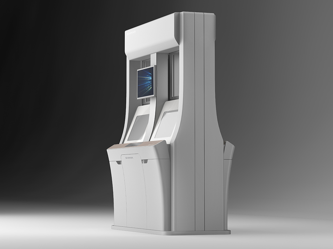
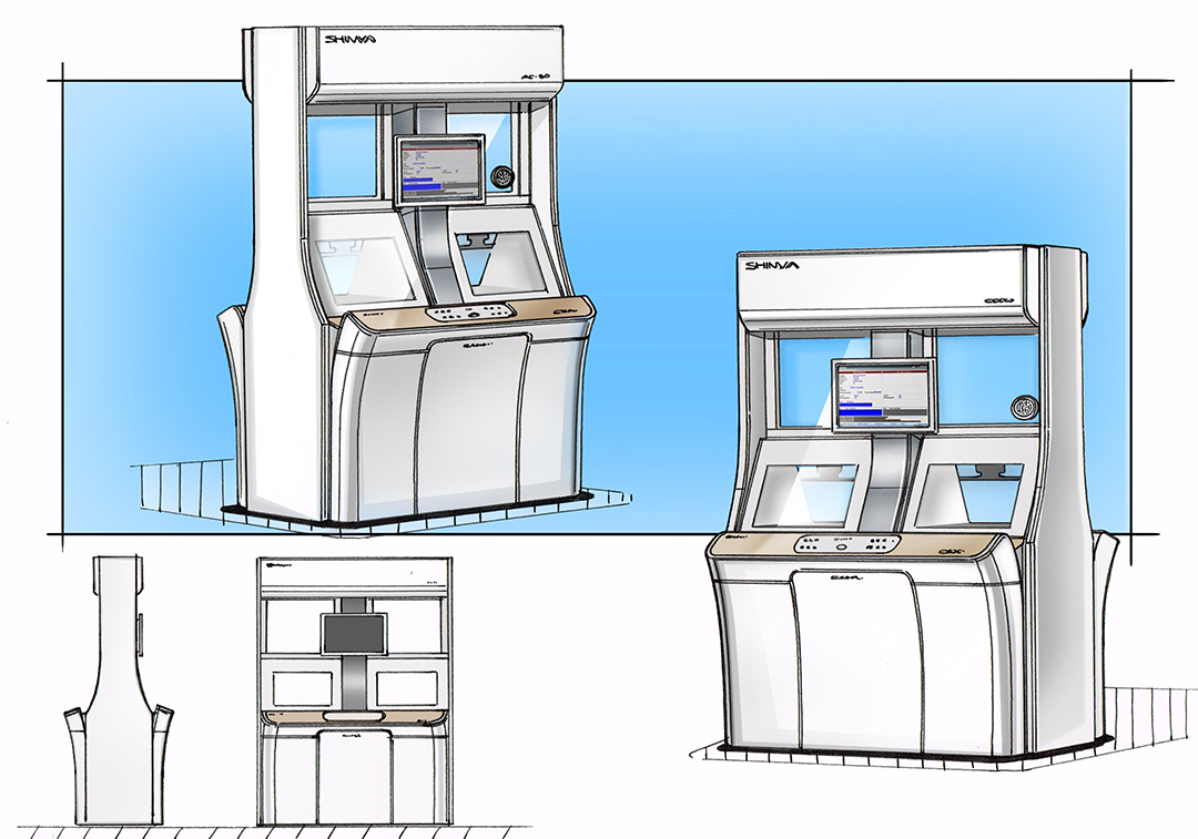
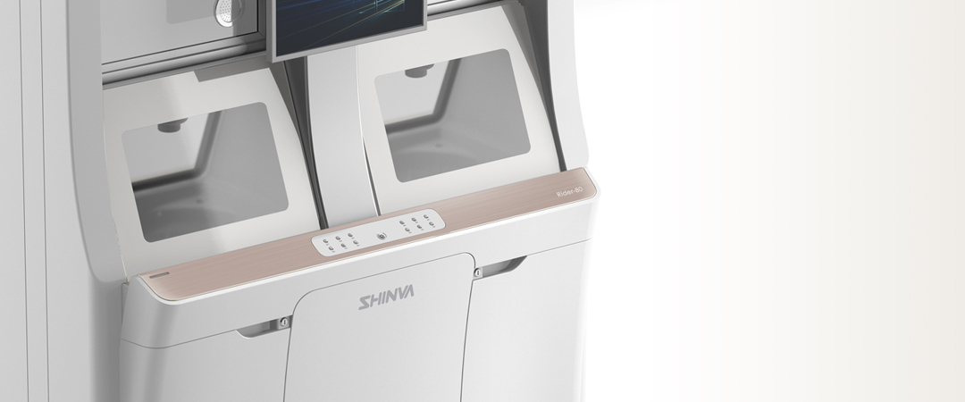
• Riader80与Riader50属于同一系列产品,本次设计的难点,在于将视觉ICON,更自然、巧妙的运用到构成完全不同、体量更大的Rider-80上,致力于将视觉ICON,上升为品牌ICON。 • 设计师以植物的枝芽为设计灵感,用优雅地向外延伸的曲线,将两侧的控制面板衬托起来,观察窗和控制面板都设计成向上倾斜的角度,更适合站姿观察和操作。同时,白色和香槟金的搭配,符合了新华系列化产品的标准配色,但在色彩比例上下了一番功夫:大面积的白色给人以干净、清新感,不易产生压迫感,同时符合实验室中专业、高效、洁净的环境需求;小面积的香槟金精致而不落俗套,在人的视觉中心起到画龙点睛的作用;中间的支柱采用银色金属效果,增加了层次,同时也更添专业稳重感。 |
• Riader80 and Riader50 belong to the same series of products. The difficulty of this design is to apply visual ICON more naturally and ingeniously to Rider-80 which is totally different in composition and size and to upgrade the visual ICON to the brand ICON. • Taking the plant shoots as the design inspiration, the designer uses the graceful outward extending curve to set off the control panels on both sides with the observation window and control panel tilt upward to make the device more comfortable for observers and operators working in standing posture. At the same time, the matching of white and champagne gold conforms to the standard color matching of Xinhua series products. However, efforts have been made on the color proportion---a larger area of white gives people a clean and fresh feeling without oppression while meeting the professional, efficient and clean environmental in the laboratory; a smaller area of champagne gold is exquisite and unconventional, bringing out the crucial point in the visual center; the pillar in the middle adopts silver metal effect, increasing the sense of depth and also adding a professional sense of stability. |
|
|
服务内容 设计研究 造型设计 模型制作 |
SERVISE Mockup Making , Style Design , Rearch Design |